Component library overview
The UI Set
Available components
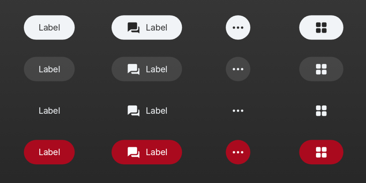
Includes `PrimaryButton`, `SecondaryButton`, `BorderlessButton`, `DestructiveButton`, `TextTileButton`, `ButtonShelf`, and their icon/circle variants. Covers actions and selections.
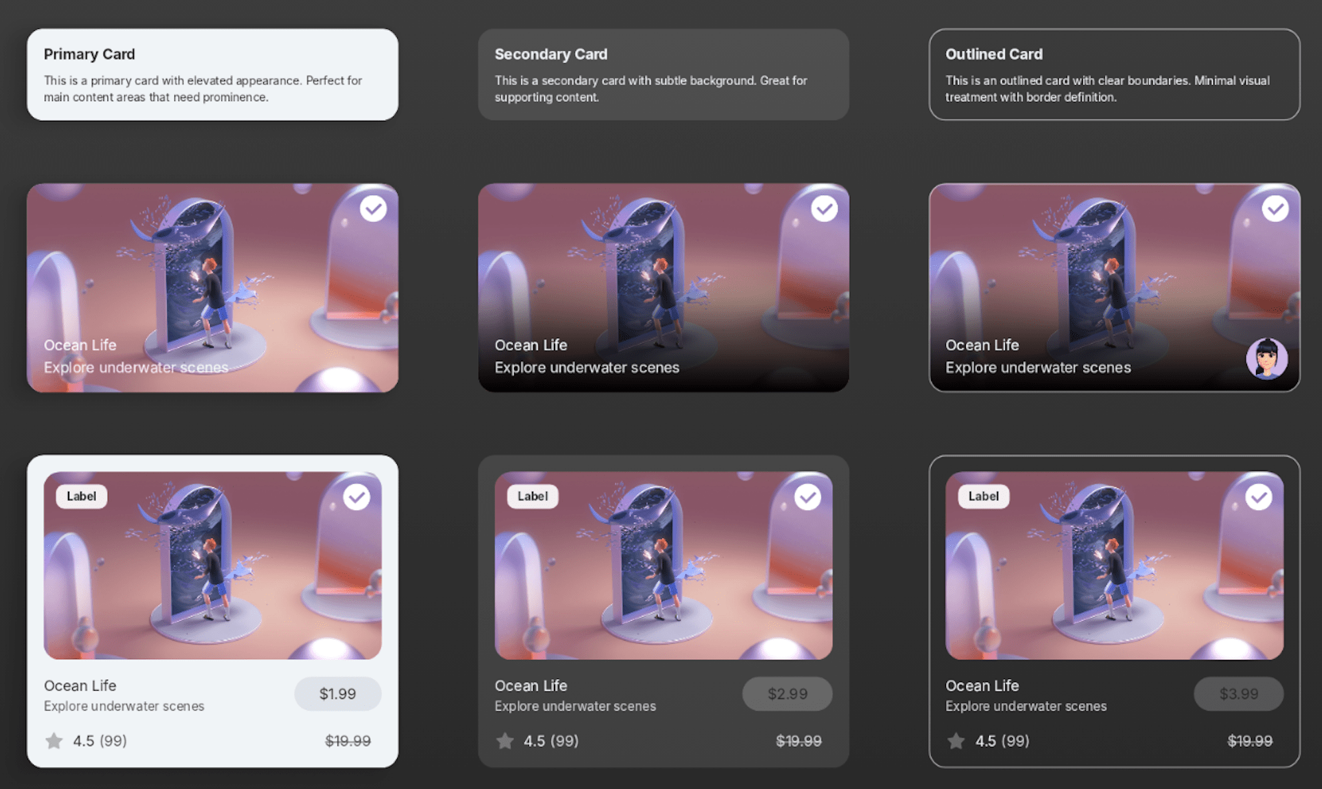
Includes `PrimaryCard`, `SecondaryCard`, and `OutlinedCard`. For creating structure in spatial interfaces.
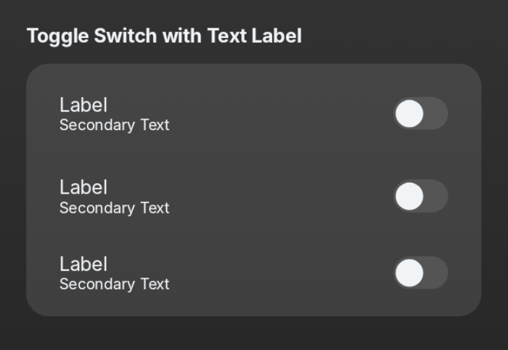
Includes `SpatialCheckbox`, `SpatialRadioButton`, `SpatialSwitch`. For toggling states and single/multiple choice selections.
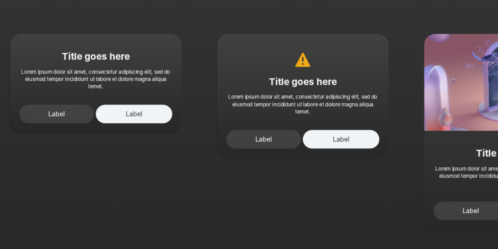
Includes `SpatialBasicDialog`, `SpatialIconDialog`, `SpatialInfoDialog`, `SpatialChoiceListDialog`. For presenting modal information and actions.
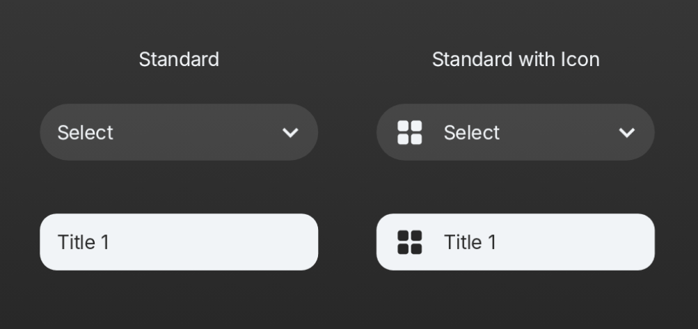
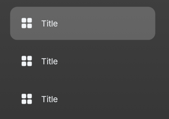
Includes `SpatialDropdown` and `SpatialIconDropdown`. For selecting one option from a hidden list.

Includes `SpatialTextField` and `SpatialSearchBar`. For text entry and searching.
Includes `SpatialSideNavItem`. For use in side navigation menus.
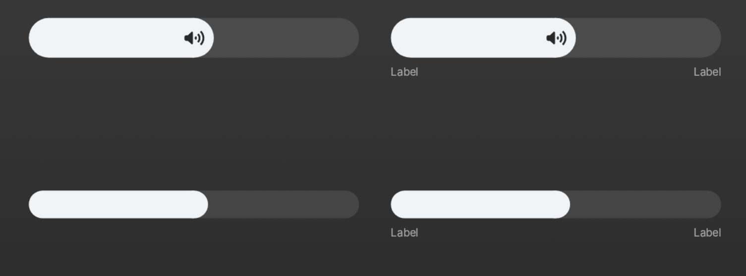
Includes `SpatialSliderLarge`, `SpatialSliderMedium`, `SpatialSliderSmall`. For selecting a value within a range.
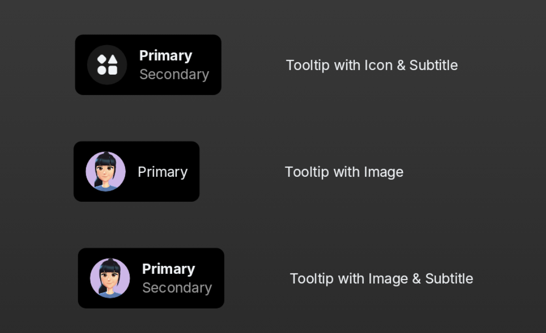
Includes `SpatialTooltip` and `SpatialTooltipContent`. For displaying contextual information on hover.
